 Development
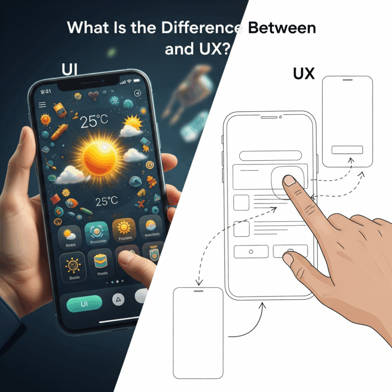
What Is the Difference Between UI and UX? A Complete i2d Guide
When browsing websites or using mobile apps, you’ve likely encountered the terms UI and UX. These buzzwords appear everywhere in the digital world, yet many...
Read More

How to design a good web page: A good web page starts with a clear goal and a defined audience. Use a simple, scannable layout,...

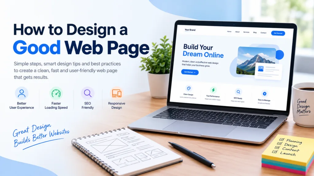
How to design a good web page: A good web page starts with a clear goal and a defined audience. Use a simple, scannable layout, fast loading speeds, mobile-first design, readable typography, high-quality visuals and one clear call to action. Make sure it is accessible, SEO-friendly and easy to navigate so visitors find what they need quickly.
You have about five seconds. That is roughly how long a visitor gives your web page before deciding to stay or hit the back button. In that short window, your page has to look trustworthy, load quickly, and show people they have landed in the right place.
Learning how to design a good web page is not about chasing trends or piling on flashy effects. It is about making things clear, fast and genuinely helpful for the person on the other side of the screen. Whether you are building a page for a café in Wellington, a tradie in Hamilton or an online shop shipping across Aotearoa, the fundamentals are the same.
This guide walks through every step, from planning to polish, so you can build pages that look good, rank well and turn visitors into customers.
Before you pick a colour or open a design tool, answer one question: what is this page meant to do?
Every strong web page has a single main job. It might be to book a consultation, sell a product, collect an email address or explain a service. When a page tries to do five things at once, visitors feel confused and do none of them.
Write your goal in one sentence. For example: “This page helps Auckland homeowners request a free quote for a kitchen renovation.” That sentence becomes your filter. If an element does not support the goal, it does not belong on the page.
Next, think about your audience. Who are they? What do they already know? What worries them? A page for first-home buyers needs a different tone and structure from a page aimed at commercial property managers. Spend time talking to real customers, reading their reviews and checking the questions they ask your team. That research is more valuable than any design trend.
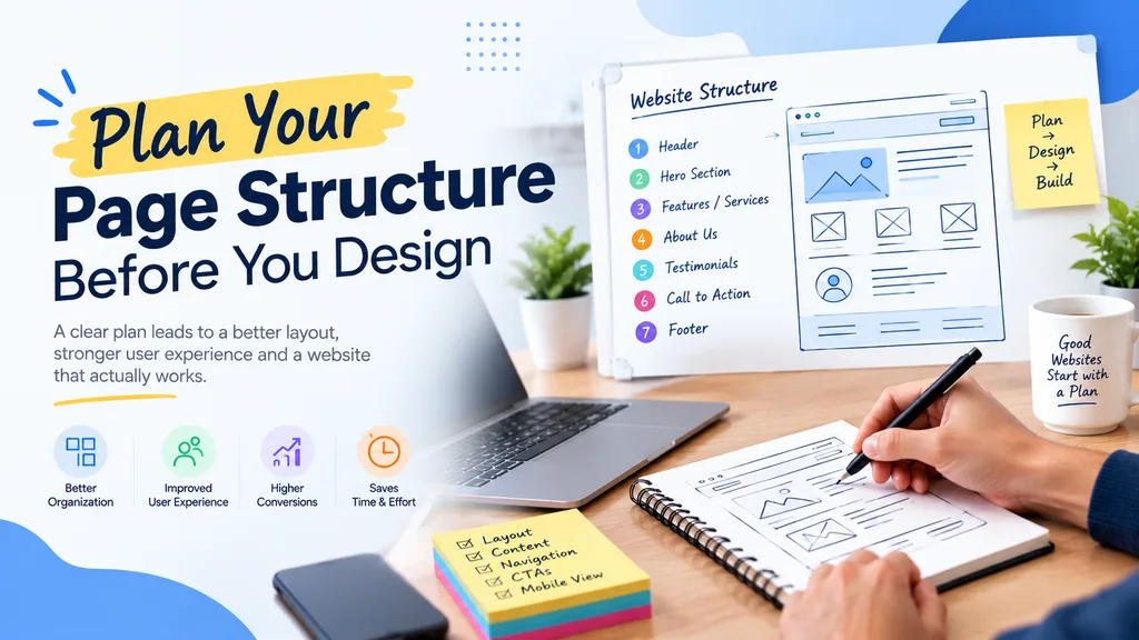
Think of a web page like a good conversation. It has an opening, a middle and a clear next step.
A reliable structure looks like this:
Sketch this on paper or in a simple wireframe first. Wireframing lets you rearrange content without worrying about colours, fonts or images. It is far cheaper to move a box on a sketch than to rebuild a finished page.
Visual hierarchy is the order in which people notice things on your page. You control it with size, colour, contrast, spacing and position.
The most important element, usually your headline or main call to action, should be the most prominent. Secondary information should be smaller or quieter. People rarely read web pages word for word. They scan in patterns, often moving across the top and then down the left side. Place your key messages where the eye naturally lands.
Some practical ways to build strong hierarchy:
If you squint at your page and cannot tell what matters most, the hierarchy needs work.
Many business owners feel nervous about empty space. They worry it looks wasteful and try to fill every gap with text, images and banners. In reality, white space (also called negative space) is one of the best tools you have.
Generous spacing around headings, paragraphs and images makes content easier to read and gives your design a calm, confident feel. It also helps visitors focus on what matters. Premium brands almost always use plenty of white space for exactly this reason.
If your page feels cramped, try increasing the margins and line spacing before you add anything new.
Great content is useless if people struggle to read it. Good typography is quiet. Visitors should never have to think about it.
Keep these guidelines in mind:
Pick fonts that suit your brand personality but never sacrifice legibility for style. A decorative script font might look charming on a wedding invitation, but it will frustrate readers on a service page.
Colour shapes emotion and trust. Blue often signals reliability, green suggests growth or sustainability, and orange or red can create urgency. But the “right” colours are the ones that fit your brand and your audience.
A simple rule is to choose one primary colour, one secondary colour and a neutral background. Reserve a bright accent colour for buttons and key actions so they pop off the page.
Contrast matters enormously. Light grey text on a white background might look sleek, but many people cannot read it. Check your contrast ratios against the Web Content Accessibility Guidelines (WCAG) to make sure your text is readable for everyone, including people with low vision or colour blindness.
Most people now browse on their phones. If your page only works well on a large desktop screen, you are letting down the majority of your visitors and hurting your search performance too, since Google primarily uses the mobile version of your content for indexing and ranking.
Mobile-first design means you start with the smallest screen and build up. This forces you to prioritise ruthlessly. What does a visitor absolutely need to see on a small screen? Start there, then add enhancements for larger devices.
Key mobile considerations include:
Test your page on real devices, not just a resized browser window. Borrow a few phones from friends and family and watch how they use your page.
Slow pages lose visitors. Studies repeatedly show that bounce rates climb sharply as load time increases. Speed is also a ranking factor, so a sluggish page hurts you twice.
Google measures page experience using Core Web Vitals, which cover loading performance, interactivity and visual stability. You can check how your page performs with free tools like PageSpeed Insights.
To speed things up:
Hosting location matters for New Zealand businesses. If most of your customers are Kiwis, hosting your site locally or on a network with strong Australasian coverage can noticeably improve load times.
Images and video bring a page to life, but only when they add value. Generic stock photos of smiling people in suits rarely build trust. Authentic photos of your team, your work and your customers almost always perform better.
When choosing visuals:
If you are working with a local agency for web design Auckland businesses trust, ask them to include a photography plan in the project. Original images make a measurable difference to credibility.
Design and copy work together. A beautiful layout cannot rescue confusing or boring writing.
Write for humans first and search engines second. Use plain language, short sentences and short paragraphs. Break up content with descriptive subheadings, bullet points and bolded key phrases so people can scan and still get the message.
Lead with benefits, not features. Instead of “Our software has cloud storage,” say “Access your files from anywhere, without worrying about losing them.” Always answer the visitor’s silent question: what is in it for me?
Make sure your headings follow a logical order, with one H1 per page and H2 and H3 subheadings beneath it. This structure helps readers, screen readers and search engines understand your content.
If visitors cannot find what they are looking for within a few seconds, they leave. Good navigation feels invisible.
Keep your main menu short, ideally five to seven items, and use clear labels. “Services” beats “What We Do,” and “Contact” beats “Let’s Connect.” Be conventional where it helps. People expect the logo in the top left that links back to the homepage, and they expect the menu near the top.
Add helpful extras such as breadcrumbs on deeper pages, a visible search bar for larger sites, and a sticky header so the menu stays handy as visitors scroll. Link related pages together, for instance from a blog post to your services page, so visitors can keep exploring naturally.
A call to action (CTA) is the moment your page asks for something. It is where interest turns into enquiries, sales or sign-ups.
Effective CTAs share a few traits:
Do not bury your CTA or give visitors too many competing options. One primary action per page keeps people focused.
Kiwis value honesty and down-to-earth service. Show visitors you are the real deal by including genuine testimonials, Google review snippets, case studies and credentials. Display contact details clearly, including a phone number, email and physical address if you have one.
Secure your site with HTTPS, and link to clear privacy and terms pages. Small signals like these reassure visitors, especially when they are about to share personal details or make a payment.
A good web page needs to be found, not just admired. Build SEO into your design process rather than bolting it on afterwards.
Focus on these on-page basics:
Google’s own SEO Starter Guide is an excellent, free place to learn the fundamentals straight from the source.
If you are targeting customers across the country, working with providers who understand Website Design NZ standards and local search behaviour gives you a real edge over generic overseas templates.
An accessible page works for everyone, including people with visual, hearing, motor or cognitive disabilities. It is also simply good design, and it often improves usability for all visitors.
Accessibility basics include:
The New Zealand Government’s web accessibility standard offers practical guidance and is worth a read even if you are not building a government site.
Launching your page is the starting line, not the finish. The best-performing pages are refined over time using real data.
Use tools like Google Analytics and Search Console to see how visitors arrive, where they click and where they drop off. Heatmaps and session recordings can reveal frustrations you would never spot by eye. Try A/B testing on headlines, button colours or layouts to see what genuinely lifts results.
Ask for feedback too. A short survey or a few friendly conversations with customers can uncover issues that analytics alone will miss.
A beautiful page that is broken, outdated or hacked does more harm than good. Plugins fall behind, software needs patching, and content goes stale. Regular upkeep protects your investment, keeps your page fast and safeguards your reputation. Reliable Website Maintenance Services take care of updates, backups, security monitoring and performance checks, so you can focus on running your business instead of fixing problems.
Even experienced teams stumble on the same few issues. Watch out for these:
If you recognise any of these on your own page, fix them first. Small improvements here often deliver the biggest wins.
Designing a good web page comes down to empathy and clarity. Know what your visitors want, make the path to it simple, and remove everything that gets in the way. Pair a clean layout with fast performance, readable content, trustworthy details and a confident call to action, and you will have a page that serves both people and search engines.
If you would rather leave the heavy lifting to specialists, the team at i2D can help you plan, design and launch pages built to perform. Start with the principles above, keep testing, and keep improving. A great web page is never really finished, and that is what keeps it great.
Visitors typically decide within about five seconds whether to stay or leave. A clear headline, a clean layout and quick loading help you make a strong first impression in that short window.
There is no single best layout, but most high-performing pages follow a simple flow: a headline and introduction, supporting benefits or features, social proof, and a clear call to action. Keeping the layout uncluttered with plenty of white space makes it easier to scan.
Mobile design is essential. Most web traffic comes from phones, and Google primarily uses the mobile version of a page for indexing and ranking. A mobile-first approach ensures your page loads fast and works smoothly on small screens.
Length depends on the page's purpose. A landing page may need only a few hundred words, while an in-depth guide can run well beyond 1,500. Focus on covering the topic fully and clearly rather than hitting a set word count.
Choose two readable fonts at most, with body text of at least 16 pixels. Pick a simple palette of a primary colour, a secondary colour and a neutral background, and use a bright accent colour for buttons. Always check contrast so text stays readable.
Review key pages at least every few months, and update content whenever your services, pricing or contact details change. Regular software updates, backups and security checks should happen continually to keep the page fast and safe.
 Development
When browsing websites or using mobile apps, you’ve likely encountered the terms UI and UX. These buzzwords appear everywhere in the digital world, yet many...
Read More Development
A good website is more than just a nice-looking brochure. It’s often the first thing a customer sees about your brand, a great way to...
Read More Development
Most Auckland businesses pour thousands of dollars into Google Ads and SEO content — then watch their rankings plateau. The culprit? A slow website that...
Read More