For Auckland organisations, accessibility in web design is no longer a specialist extra or a final-stage technical check. It is part of how modern websites earn trust, serve more people, improve usability and support long-term digital performance. WCAG for NZ Businesses gives business owners a practical framework for making websites easier to use for people with different abilities, devices, environments and preferences.
The Web Content Accessibility Guidelines, commonly known as WCAG, are internationally recognised standards created to make web content more accessible. WCAG 2.2 explains that accessibility supports people with blindness, low vision, deafness, hearing loss, limited movement, speech disabilities, photosensitivity and cognitive or learning limitations, while also improving usability for the wider public.
In New Zealand , government digital standards refer directly to WCAG 2.2 Level AA for mandated public-sector websites, which makes the framework an important benchmark for any organisation that wants to meet strong local expectations.
Why Accessibility Matters for Auckland Websites
Auckland businesses serve a diverse audience across suburbs, industries, age groups, cultures and digital confidence levels. A website that only works for a narrow group of users can quietly lose enquiries, bookings, applications and sales. Accessible design helps remove those barriers by improving the way information is structured, read, navigated and understood.
“Accessible design is not only about disability support; it is about making digital services clear, reliable and usable for the widest possible audience.”
For a local service provider, retailer, consultant, property firm or professional practice, accessibility shapes customer trust and user experience. WCAG for NZ Businesses helps create inclusive websites that are easy to navigate, mobile-friendly, and usable for all visitors. Following WCAG for NZ Businesses during planning, design, development, and maintenance improves engagement, accessibility compliance, and overall website performance for NZ businesses.
Accessibility as a Trust Signal
Trust is built when a website feels professional, predictable and considerate. Clear headings, readable text, consistent navigation, descriptive links and accessible forms show that a business has thought about the needs of real users. For Auckland businesses competing online, these details can help create a stronger impression than visual style alone. Following WCAG for NZ Businesses also improves usability, accessibility compliance, and customer confidence across all devices.
Accessibility also supports brand reputation. When users can complete tasks without frustration, they are more likely to contact the business, recommend it and return later. In this way, accessibility becomes part of customer experience, not merely a compliance issue. Following WCAG for NZ Businesses helps companies build trust, improve usability, and create a more inclusive digital experience for every visitor.
Inclusive Design for Real Users
Inclusive design means designing for different people from the beginning rather than making fixes after complaints arise. This includes users with permanent disabilities, temporary injuries, ageing-related changes, limited English confidence, slow internet connections or small mobile screens.
For example, captions help deaf and hard-of-hearing users, but they also help people watching a video in a quiet office. High colour contrast helps people with low vision, but it also helps anyone viewing a screen in bright Auckland sunlight. Keyboard navigation supports people with motor impairments, but it also benefits power users who prefer keyboard shortcuts.
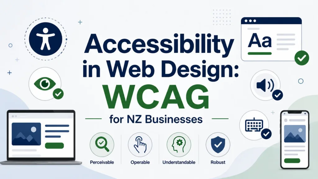
Understanding WCAG for NZ Businesses
WCAG is built around four principles: content should be perceivable, operable, understandable and robust.
These principles are often shortened to POUR. They provide a plain-language way to assess whether a website can be accessed, navigated and understood by people using different technologies and abilities.
For WCAG for NZ Businesses, the most practical target is usually WCAG Level AA. Level A covers the most basic accessibility requirements, Level AA is widely treated as the strong standard for usable public websites, and Level AAA is the highest level, which may not be practical for every page or business context. New Zealand’s government accessibility standard points to WCAG 2.2 Level AA, making it a useful reference point for private-sector organisations as well.
The Four WCAG Principles
The first principle, perceivable, means users must be able to recognise and access information. This includes text alternatives for images, captions for video, sufficient colour contrast and layouts that do not rely only on colour.
The second principle, operable, means users must be able to interact with the site. Keyboard navigation, visible focus indicators, accessible menus and controls that do not require difficult gestures all support this principle.
The third principle, understandable, means content and interfaces should be clear. Helpful headings, plain wording, predictable navigation, labelled forms and useful error messages all make a website easier to use.
The fourth principle, robust, means the website should work with current and future technologies, including assistive technology such as screen readers. This is where semantic HTML, proper code structure and responsible use of ARIA attributes become important.
Level AA as a Practical Benchmark
For most Auckland businesses, Level AA is a realistic and professional goal. It does not mean every website must be plain or visually basic. Instead, it means the design, code and content should meet tested accessibility success criteria that make the website usable for a wider range of people.
A Level AA approach encourages teams to think about text contrast, responsive layouts, form labelling, keyboard access, error prevention, captions, consistent navigation and accessible page structure. These are not abstract technical details. They influence how well a customer can request a quote, read a service page, book a consultation or complete a checkout.
Key Accessibility Features Every Business Website Needs
A practical accessibility plan should focus on the elements users interact with every day. Beautiful design is valuable, but it must be supported by structure, readability and reliable functionality. The best accessible websites combine strong visual presentation with thoughtful content and technically sound development.
Auckland businesses reviewing their websites should begin with the basics. The following points can identify common improvements without making accessibility feel overwhelming:
- Use descriptive alt text for meaningful images and avoid vague labels such as “image” or “photo”.
- Maintain strong colour contrast between text and background, especially on buttons and calls to action.
- Ensure all menus, forms and interactive elements can be used with a keyboard.•Write clear headings, descriptive link text and helpful form error messages.
- Provide captions or transcripts for important video and audio content.
Clear Structure and Semantic HTML
Semantic HTML gives a web page meaning. Proper headings, lists, buttons, labels and landmarks help browsers and assistive technologies interpret the content correctly. A screen reader user should be able to understand the page structure, move between sections and identify important actions without having to guess.
This structure also supports search engines because the page becomes easier to crawl and interpret. When headings accurately reflect topics, links describe their destination and content is arranged logically, accessibility and search visibility often improve together.
Colour Contrast, Text and Media
Colour contrast is one of the most visible accessibility issues. Light grey text on a white background, thin fonts, text over busy images and low-contrast buttons can all make content difficult to read. Strong contrast helps users with low vision, older users and anyone viewing a screen in less-than-ideal lighting.
Text alternatives also matter. Images that communicate meaning should have helpful alt text. Videos should include captions where they provide important information. Audio content should have transcripts when relevant. These improvements make content more flexible and usable across different contexts.
Forms, Buttons and Keyboard Navigation
Forms are often where conversions happen, so they must be accessible. Every input should have a clear label, instructions should be easy to understand, and error messages should explain what went wrong and how to fix it. A user should not be forced to rely on colour alone to understand an error.
Keyboard navigation is equally important. Users should be able to move through menus, links, buttons and forms using the keyboard alone. Visible focus indicators show where the user is on the page. Without them, people using keyboards or assistive technology can become lost.
How Accessibility Supports SEO and Conversions
Accessibility and SEO are closely connected because both rely on clarity, structure and user experience. A search-friendly website is usually easy for both people and crawlers to understand. An accessible website uses logical headings, meaningful links, readable copy, fast-loading pages and mobile-friendly layouts, which are also important for search performance.
For businesses investing in Website Design Auckland, accessibility should sit alongside responsive design, content planning, technical SEO and conversion strategy. A website that ranks but frustrates users will waste traffic. A website that is accessible, fast and persuasive is more likely to turn visitors into leads.
Better Content for Users and Search Engines
Accessible content is usually well-organised content. It uses headings to guide the reader, short paragraphs to improve readability, descriptive links to set expectations and plain language to reduce confusion. These same qualities help search engines understand page topics and relationships.
For example, a service page with clear H2 and H3 headings, useful explanations, alt text for relevant images and properly labelled contact forms gives users and search engines stronger signals. This can support both organic visibility and on-page engagement.
Accessibility and mobile experience
Many Auckland customers search, compare and enquire from mobile devices. Accessibility therefore needs to work on small screens, not just desktop layouts. Buttons should be large enough to tap, text should resize cleanly, navigation should remain predictable, and forms should not become difficult to complete on mobile.
Mobile accessibility also relates to performance. If a website is heavy, slow or cluttered with unnecessary effects, users with older devices or slower connections may struggle. A well-built accessible website should feel smooth, focused and reliable across devices.
Design Choices: Minimalist vs Interactive Design
The phrase Minimalist vs Interactive Design often appears in website planning discussions because businesses want to know whether a clean, simple website or a more dynamic, animated experience will work best. From an accessibility perspective, the answer depends on purpose, execution and user control.
Minimalist design can support accessibility when it uses clear layouts, readable typography, obvious navigation and strong content hierarchy. However, minimalist design can become inaccessible if it relies on hidden menus, vague icons, low contrast or too little explanatory text. Interactive design can be engaging when it improves understanding, but it can create problems if animations distract users, controls are not keyboard accessible or motion cannot be paused.
“The most effective accessible design is not the least creative design; it is design that allows creativity without blocking access.”
When simplicity works best
Simplicity works best when users need to complete a task quickly. For service pages, contact pages, booking forms and landing pages, a clean structure usually helps users make decisions faster. Clear calls to action, straightforward copy and uncluttered sections reduce cognitive load.
This does not mean every website should look the same. It means visual choices should support the journey. A simple layout with strong headings, useful visuals and accessible forms can be both attractive and effective.
When interaction adds value
Interaction adds value when it helps users understand information, compare options or complete a task. Examples include accessible accordions for FAQs, interactive maps with text alternatives, calculators, quote forms and guided product selectors.
However, every interactive feature should be tested. It should work with a keyboard, make sense to screen readers, have visible focus states and avoid unexpected movement. If an interactive element is purely decorative and slows the website down, it may not be worth keeping.
A Practical WCAG Checklist for Auckland Businesses
A practical accessibility process does not need to happen all at once. Businesses can begin with an audit, identify the most important issues and create a staged improvement plan. The best approach combines automated testing with human review because tools can detect many issues, but they cannot judge every real user experience.
Automated tools such as Lighthouse, WAVE and axe DevTools can help identify missing alt text, contrast issues, heading problems and some form errors. Human testing is still important for keyboard navigation, screen reader flow, content clarity and real-world task completion.
Audit, fix and maintain
Start by checking the most valuable pages, such as the homepage, major service pages, contact page, booking form and checkout flow. These are the pages where accessibility problems can most directly affect enquiries and revenue.
After the audit, prioritise fixes based on user impact. Critical issues might include inaccessible navigation, forms without labels, low-contrast calls to action or missing focus indicators. Once fixed, accessibility should become part of ongoing website maintenance, not a one-off project.
Build accessibility into future updates
Accessibility is easiest when it is included from the start. New pages should use proper headings, descriptive links, alt text, clear form labels and tested layouts. Designers, writers, developers and business owners should all understand the basics so new content does not reintroduce old problems.
For Auckland businesses, WCAG for NZ Businesses is ultimately about better digital service. It supports disabled users, improves everyday usability, strengthens SEO foundations and helps businesses communicate more professionally online. A website that is perceivable, operable, understandable and robust is not only more accessible; it is also more useful, more trustworthy and better prepared for the future.
 Landing Pages