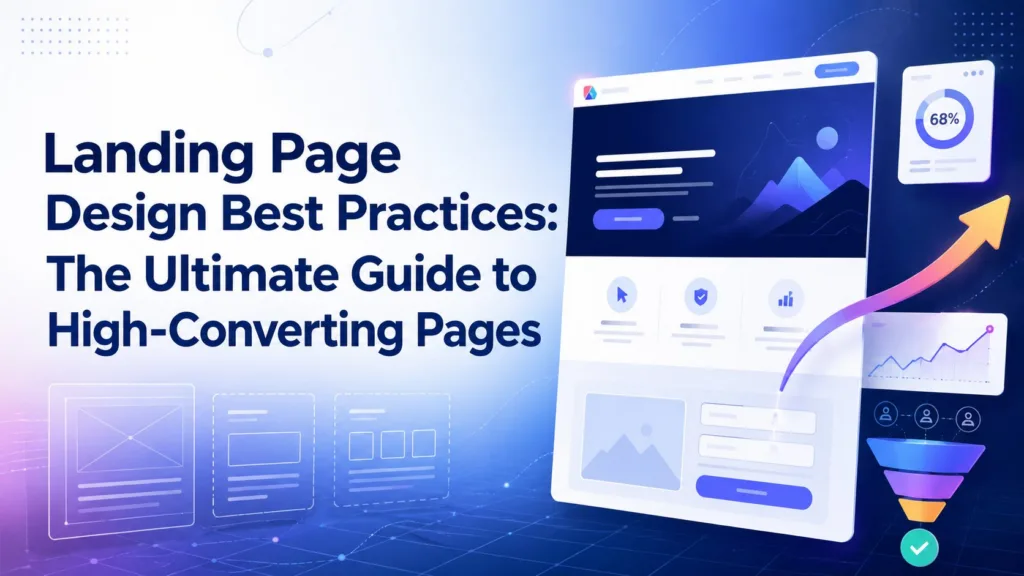
Landing Page Design Best Practices: The Ultimate Guide to High-Converting Pages
In the competitive landscape of digital marketing, driving traffic to a website is only half the battle. Whether you are running a localized campaign for...
Areesh Ishtiaq
May 25, 2026
In the competitive landscape of digital marketing, driving traffic to a website is only half the battle. Whether you are running a localized campaign for Website Design Auckland or targeting a global audience, the ultimate goal is to design a website that convert visitors into loyal customers. While many startups and local merchants rely on generic website builders for small business, achieving maximum return on investment (ROI) requires a specialized tool: the conversion-focused landing page.
Unlike a standard homepage, which serves as an exploratory hub, a landing page is a standalone destination designed with a single conversion goal. Strong Landing Page Design helps remove navigation and other standard landing page distractions, allowing businesses to focus solely on guiding landing page visitors toward a desired action. Effective Landing Page Design drastically improves conversion rates, lowers cost-per-acquisition, and creates a smoother path from visitor interest to action. This guide explores the essential landing page best practices that bridge the gap between user experience, conversion optimization, and strategic Landing Page Design decisions.
1. Introduction: The Core of High-Converting Landing Pages
To understand the mechanics of high-converting landing pages, one must first understand how they differ from standard websites. A traditional website invites exploration, whereas a landing page demands focus. Whether you are building B2B landing pages, ecommerce landing pages, or specialized product landing pages, every element of your landing page design must serve the campaign’s core objective.
A successful campaign is built on the alignment of user expectations. This starts with message match—the practice of ensuring that your landing page copy and visual elements perfectly align with the preceding ad messaging]. If a prospect clicks on one of your search ads or social ads promising a specific discount, but arrives on a page that fails to mention that offer, they will immediately bounce. To maximize relevance, sophisticated marketers use dynamic text replacement to automatically alter the page’s copy based on the specific search queries or ad variants that triggered the visit. This creates a seamless transition that satisfies searcher intent, boosting both PPC metrics and overall campaign performance.
2. Crafting the Perfect Above the Fold Experience
The digital attention span is notoriously short, with most visitors deciding whether to stay or leave in less than ten seconds. Therefore, the area above the fold—the portion of the webpage visible without scrolling—is the most critical real estate on your landing page layout.
Crafting a Magnetic Landing Page Headline and Copy
Your landing page headline is the very first thing a visitor reads. It must immediately articulate your unique sales proposition (USP) and clearly state the primary value proposition]. Rather than focusing on what your company does, frame the headline around how you solve the visitor’s problem.
The supporting landing page copy should be written as clear copy and compelling copy that expands on this initial promise. Avoid dense blocks of text; instead, present readable content utilizing structured bulleted lists to highlight product benefits and key features]. This ensures that even casual scanners can grasp your offer within seconds.
Designing the Hero Image Section to Show Product in Action
A picture is worth a thousand words, especially when it comes to capturing visitor attention. The hero image section must feature high-quality images that go beyond generic stock photography. Instead, display your product in action or your service in action.
For digital products, utilize real screenshots, product shots, and polished product mockups that let users visualize the interface. For complex services, incorporating demo videos or step-by-step animations within the hero section can increase engagement and clarify how your offering works in a matter of seconds.
3. Psychology of Visual Hierarchy and Visitor Attention
An effective landing page acts as a visual slide, guiding the visitor’s eyes effortlessly from the headline down to the conversion point. Establishing a strong visual hierarchy ensures that the most critical information receives the highest level of prominence.
Utilizing Directional Cues and Visual Indicators
Do not leave the visitor’s journey to chance. Incorporate explicit directional cues and visual indicators to guide visitor attention toward your primary call to action.
These cues can be:
Implicit Cues: A person in a hero photo looking directly toward the signup form.
Explicit Cues: Subtle arrows, contrasting lines, or gradient flows pointing downward toward the next section.
Interactive Cues: Animated buttons or scroll indicators that encourage deeper page exploration.
The CTA button itself must stand out dramatically. Use a highly contrasting color that is not used anywhere else on the page, ensuring it is immediately recognizable as an interactive element.
Leveraging White Space and Scannable Content
One of the most common mistakes in landing page design is clutter. Embracing white space, or negative space, allows your design to breathe and prevents cognitive overload. During CMS Selection, it is important to choose a platform that supports clean layouts, flexible spacing, and easy design control. When key elements are surrounded by ample white space, they naturally draw more attention.
To cater to modern reading habits, your page must offer highly scannable content. Group related ideas into distinct visual blocks, use clear subheadings, and maintain a consistent layout. This ensures that as landing page visitors scroll, they can effortlessly digest the core messaging without feeling overwhelmed.
4. Minimizing Form Friction and Streamlining Conversion Actions
For lead generation landing pages, the form is the gateway to conversion. However, forms are also the primary source of user friction. To maximize your conversion optimization efforts, you must balance the data you need with the user’s willingness to provide it.
Form Strategy
Pros
Cons
Best Use Case
Single-Step Short Forms
Minimal friction, high completion rates
Lower lead quality, limited data collection
Simple newsletter signups, free eBook downloads
Multi-Step Forms
Higher completion for complex queries, interactive
To reduce form friction, start by implementing short forms that only ask for absolutely essential information. Every additional field you add can cause a measurable drop in completion rates]. Avoid forcing users into tedious manual entry by leveraging auto-fill features and smart dropdowns.
If your campaign requires extensive information, transition to multi-step forms instead of one long, intimidating form]. Multi-step forms leverage the “Zeigarnik effect”—the psychological tendency to finish a task once it has been started. By placing low-friction questions first and showing a progress bar, you keep users engaged and significantly reduce form drop-off rates. Additionally, always place a link to your privacy policy directly beneath the form to build immediate trust regarding data security.
Establishing Trust with Authentic Testimonials and Social Proof
Modern consumers are naturally skeptical of marketing claims. To overcome this hurdle, your page must be anchored by strong social proof . This goes beyond displaying generic star ratings; you need to showcase authentic testimonials and customer reviews that feel genuine.
To maximize the impact of your social proof, include specific customer details such as full names, real photos, job titles, and company logos. Even better, incorporate video testimonials or customer action shots that demonstrate real-world satisfaction. When prospects see real people achieving success with your product, their perceived risk drops, directly boosting your conversion rates.
5. Mobile-First Optimization and Page Speed Strategies
More than half of global web traffic originates from mobile devices. If your landing page is not built with a mobile-first design philosophy, you are actively leaving revenue on the table. A slow, poorly formatted mobile experience is the fastest way to spike your cost-per-acquisition.
Mastering Mobile-Responsive Landing Page Layouts
A truly mobile-responsive landing page is not just a desktop layout shrunk down to fit a smaller screen. It requires a dedicated mobile optimization strategy. When designing for a mobile device, ensure that:
Interactive Elements: Buttons are designed as easy-to-tap buttons with a minimum target size of 48×48 pixels.
Layout Shifts: Multi-column layouts stack vertically to maintain a natural scrolling flow.
Typography: Font sizes are large enough to be easily readable without requiring pinch-to-zoom.
By focusing on these touch-friendly elements, you can significantly improve your mobile conversion rates and ensure a seamless mobile user experience.
Enhancing Page Load Time and Technical CRO Metrics
Page speed is a critical ranking factor for organic search results and a primary driver of user bounce rates. A delay of even a single second in loading time can lead to a drastic drop in conversions. To optimize your page load time, focus heavily on technical performance:
Image Optimization: Compress all visual assets, convert them to modern formats like WebP, and implement lazy loading.
Code Minification: Clean up bloated CSS and JavaScript files to minimize render-blocking resources.
Content Delivery Networks (CDNs): Serve your landing page from servers closest to your visitors to minimize latency.
By monitoring user behavior metrics and keeping your load times under two seconds, you create a fast, frictionless experience that keeps visitors engaged.
6. Continuous Conversion Optimization: A/B Testing and PPC Campaigns
No landing page is ever truly “finished.” The most successful campaigns are those that undergo continuous conversion optimization based on real-world user data].
To achieve this, marketers rely on A/B testing (or split testing). By creating multiple landing page variants and using a testing platform to split traffic evenly between them, you can isolate exactly which elements drive better performance. Test one variable at a time—such as your headline, the color of your CTA button, or the structure of your form—to gather clean, actionable data.
Furthermore, your landing page strategy must adapt to where your traffic is coming from. A paid landing page designed for PPC campaigns should focus heavily on immediate conversion actions and high-intent keyword matching. Conversely, an organic landing page designed to rank in organic search results must balance conversion with search engine optimization (SEO) best practices, integrating relevant keywords naturally to satisfy both search engines and human readers.
Once a visitor completes the desired action, do not let the journey end. Redirect them to a dedicated thank you page. This page not only confirms their action but also opens up valuable post-conversion opportunities, such as inviting them to follow your social channels, read your latest blog posts, or explore a secondary product offer. By mapping out this entire buyer’s journey, you maximize the lifetime value of every single click.
To guide your ongoing optimization, continuously monitor both CRO metrics and PPC metrics. Track high-level indicators like landing page performance, time on page, and scroll depth to understand how users interact with your content. By combining these insights with high-quality, conversion-focused landing page templates, you can build a scalable marketing engine that consistently converts visitors into customers.


 Google Ads