New Zealanders use websites while commuting, comparing local businesses, checking maps, reading reviews, booking services and making quick purchase decisions. For Auckland businesses in particular,...
Areesh Ishtiaq
May 12, 2026
New Zealanders use websites while commuting, comparing local businesses, checking maps, reading reviews, booking services and making quick purchase decisions. For Auckland businesses in particular, a website often needs to work well for people who are searching from a phone, standing outside a shop, sitting on the bus, or comparing providers during a lunch break. This is where Mobile First Design becomes more than a design trend. It is a practical way to build faster, clearer and more useful digital experiences.
Mobile First Design means designing for small screens first, then expanding the layout for tablets, laptops and desktops. Instead of creating a desktop website and forcing it to fit a phone later, the mobile-first approach starts with the most essential content, navigation and actions. Top-ranking resources on this topic consistently highlight content prioritisation, responsive design, touch-friendly navigation, performance, accessibility, scalable typography and mobile-first indexing as central ideas.
Professional insight: A mobile-first website is not simply a smaller version of a desktop website. It is a focused digital experience built around how people search, read, tap and decide on mobile devices.
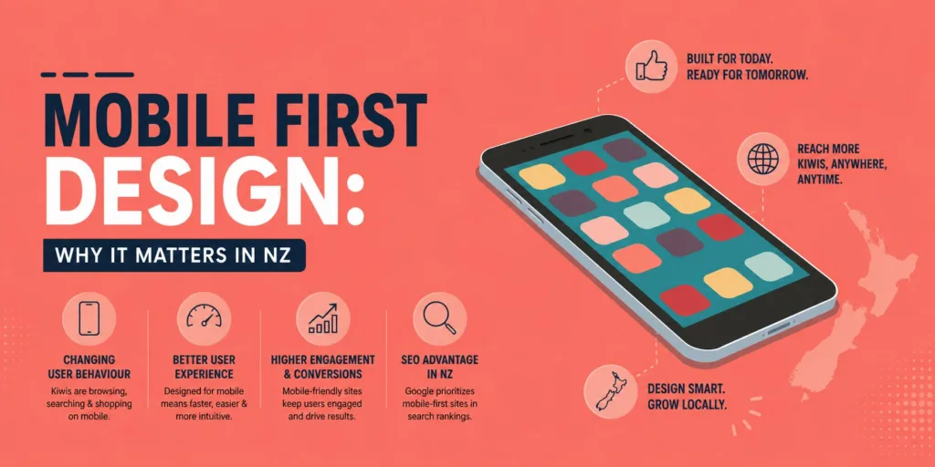
Why Mobile First Design Matters for NZ Businesses
For businesses in Auckland and across New Zealand, mobile-first thinking reflects how customers already behave. People do not wait until they are at a desktop computer to look for a plumber, café, lawyer, real estate agency, clinic, accountant or online shop. They search from mobile devices because it is immediate and convenient.
A mobile-first website respects that behaviour. It makes the most important information easy to find, keeps the design clean, reduces loading delays and helps visitors take action quickly. This matters because a potential customer who struggles to read text, tap buttons or find contact details may leave and choose a competitor.
Mobile Users Expect Speed and Simplicity
Mobile users usually want results quickly. They may be using mobile data, moving between locations or browsing with limited attention. A mobile website that loads slowly, hides key information or requires excessive scrolling creates friction at exactly the wrong moment.
This is why mobile-first layouts typically favour clear headings, concise copy, visible calls-to-action and simple user flows. A visitor should be able to understand what the business offers, where it operates and what to do next without pinching, zooming or searching through cluttered menus.
Local Search Often Starts on a Phone
Local search is strongly connected to mobile behaviour. Auckland customers may search for a service near them, compare reviews, open directions, call directly from search results or submit an enquiry form from their phone. A website that supports this journey can turn mobile visits into real leads.
For local businesses, mobile-first planning should include clickable phone numbers, location details, clear service areas, fast contact forms and a navigation structure that makes local pages easy to reach. These design decisions support both user experience and search visibility.
A professional mobile-first local page should make the customer journey obvious by ensuring that:
the main service message is visible without unnecessary scrolling;
the phone number, enquiry form and map links are easy to tap;
the page loads quickly on mobile data; and
testimonials, service areas and trust signals appear before the visitor loses interest.
How Mobile First Design Differs from Responsive Design
Mobile-first and responsive design are related, but they are not exactly the same. Responsive design allows a website to adapt to different screen sizes. Mobile First Design goes further by deciding that the smallest screen should be the starting point for the design process.
Figma explains that mobile-first design prioritises mobile devices and essential content before adding more detail for larger screens, while responsive design focuses on adapting layouts to fit any screen size.
Wix similarly describes mobile-first as designing around mobile users’ needs and smaller-screen limits from the beginning.
Progressive Enhancement Instead of Shrinking Desktop Layouts
A mobile-first approach uses the idea of progressive enhancement. The design begins with the core experience for a phone, then adds more space, imagery, layout variation or supporting content for larger screens. This usually creates a cleaner website because unnecessary elements are filtered out early.
The opposite approach is sometimes called graceful degradation, where a desktop design is reduced for mobile. That can work, but it often leads to compromises. Large hero sections, complex menus, oversized images and multi-column layouts may look impressive on desktop but become awkward on a phone.
Responsive Layouts Still Need Mobile Priorities
A responsive website can still provide a poor mobile experience if the content hierarchy is wrong. For example, a page may technically resize, but the phone version might still show too much text, oversized images, hidden buttons or navigation that requires too many taps.
Mobile-first design solves this by asking what a mobile visitor needs first. The answer may be a booking button, a service summary, a map link, pricing guidance, proof of trust or a short explanation of what the business does. Once those priorities are clear, the responsive layout can support them properly.
Core UX Principles Behind Mobile First Design
Good mobile-first design is built around user experience. It is not simply about making a page narrower. It is about making the website easier to understand, easier to use and faster to act on.
Across the top-reviewed sources, repeated UX principles include content inventory, visual hierarchy, simplified navigation, touch-friendly elements, readable typography, testing on real devices and avoiding disruptive pop-ups.
These ideas are especially valuable for Auckland businesses that rely on enquiries, bookings and local trust.
Content Hierarchy and Visual Hierarchy
Content hierarchy means deciding what information deserves priority. On a mobile screen, there is limited room, so every section should justify its place. The most important message should appear early, followed by proof, details and action steps.
Visual hierarchy supports this through headings, spacing, contrast, font size and button placement. A strong mobile page guides the eye naturally. Visitors should not have to guess where to look or what to tap. Clear hierarchy also helps make longer service pages easier to scan.
Thumb-Friendly Navigation and Touch Targets
Mobile websites are used with fingers, not mouse cursors. This means buttons, menu items and form fields need enough space to be tapped comfortably. GeeksforGeeks highlights larger buttons, expanded touch targets and avoiding hover-dependent interactions as key mobile-first practices.
Navigation should also be simple. A hamburger menu, bottom navigation bar or short top menu can work well if it is intuitive. What matters most is that users can reach important pages quickly, without fighting tiny links or confusing dropdowns.
Readable Typography and Accessible Design
Mobile-first design should support accessibility. Text should be large enough to read, colour contrast should be strong, and interactive elements should be easy to identify. Alt text, logical headings and clear labels also help people using assistive technology.
Readable typography matters in practical terms as well. Auckland customers may be reading outdoors, on public transport or in a hurry. A clean font, appropriate line spacing and enough white space can make the difference between a page that feels professional and one that feels frustrating.
Mobile First Design, SEO and Website Performance
Mobile-first design has a direct relationship with search engine optimisation because Google uses mobile-first indexing and evaluates the mobile version of pages for indexing and ranking.
That does not mean design alone guarantees rankings, but it does mean mobile usability, crawlable content and performance should be planned together.
For many NZ businesses, mobile-first design connects user experience, technical SEO and conversion strategy. Some teams may even file this work under Techinical SEO, because it includes performance, crawlability, mobile usability, structured content and page experience checks.
Page Speed, Core Web Vitals and Bounce Rate
Performance is one of the strongest practical benefits of a mobile-first approach. When a website is designed for mobile from the start, it is more likely to use lean layouts, compressed images, efficient code and fewer unnecessary effects. Figma identifies optimised performance and faster load times as benefits of the mobile-first process.
Page speed also influences user behaviour. If a page feels slow, visitors may bounce before they see the offer. Core Web Vitals help measure whether a page loads quickly, responds smoothly and remains visually stable. These checks are especially important for service businesses and ecommerce websites where every delay can reduce enquiries or sales.
Image Optimisation and Lightweight Layouts
Images are often the reason mobile pages become slow. Mobile-first design encourages designers to use the right image sizes, modern formats, compressed files and layouts that do not depend on oversized visuals. This does not mean websites should look plain. It means visual design should be purposeful.
Auckland businesses can still use strong branding, photography and visual storytelling, but the assets should be prepared for mobile users first. Smaller screens need clarity, not clutter. A well-optimised image can support trust and professionalism without damaging performance.
A Practical Mobile-First Design Process
A reliable mobile-first process starts before the first page is built. It begins with business goals, customer needs, content planning and technical requirements. The best results come when designers, developers, writers and SEO specialists work together early.
If an Auckland business is planning a new website or redesign, professional Website Design Auckland support can help ensure the mobile experience, search structure and conversion journey are considered from the beginning rather than patched together later.
Start With Wireframes and Content Inventory
Wireframing helps map the mobile layout before visual design takes over. It shows where the hero message, service information, calls-to-action, testimonials, contact details and supporting content should sit. GeeksforGeeks lists wireframing and content inventory as important steps in the mobile-first design process.
A content inventory is equally useful. It helps identify what content exists, what is missing and what can be simplified. For a local business, this might include service descriptions, suburb pages, staff profiles, FAQs, case studies, reviews and contact information.
Test on Real Devices Before Launch
Testing on real devices is essential because a design can look good in a desktop preview but behave differently on an actual phone. Buttons may be too close together, forms may be awkward, text may wrap badly, or images may take too long to load on mobile data.
Testing should include different phones, browsers, screen sizes and connection speeds where possible. It should also include practical user tasks, such as finding a service, submitting a form, calling the business or navigating back to the homepage.
Mobile-first element
What to check
Why it matters for NZ users
Navigation
Menus, buttons and service links are easy to tap
Helps mobile visitors move quickly
Content hierarchy
Key information appears early
Reduces confusion and scrolling
Performance
Images, scripts and layouts are optimised
Supports faster mobile browsing
Accessibility
Fonts, contrast and labels are clear
Makes the site usable for more people
Local conversion
Calls, maps and forms work smoothly
Turns Auckland searches into enquiries
Why Auckland Websites Need a Mobile-First Future
Auckland is a competitive market, and customers often compare businesses quickly. A mobile-first website can create a stronger first impression by making the browsing experience fast, clear and trustworthy. It also supports long-term digital marketing because SEO, user experience and conversion rate optimisation all benefit from better mobile foundations.
Businesses that ignore mobile-first design risk treating mobile visitors as an afterthought. That is a serious problem when many people discover brands, compare services and make decisions from their phones. A desktop-only mindset can make a modern business look outdated, even if its services are excellent
.
Final Thoughts on Mobile First Design in NZ
Key takeaway: The strongest mobile-first websites combine design clarity, technical performance and customer intent so visitors can move from search to action with confidence.
Mobile First Design matters in New Zealand because it matches real customer behaviour. It supports local search, improves usability, strengthens accessibility, encourages faster websites and helps businesses focus on what users need most. For Auckland companies, it is also a practical way to compete in a market where customers expect information instantly.
The most effective websites are not simply resized for mobile. They are planned around mobile users from the beginning, then expanded for larger screens with care. When mobile-first strategy, responsive design, content hierarchy, performance and SEO work together, a website becomes easier to use, easier to find and more effective at generating results.
 Uncategorized